
")
Calling it a “Renaulution,” French automaker Renault is the latest motorcar maker to update its corporate logo for the digital age.
“Reflecting the brand’s heritage, the logo is uncluttered with no signature or typography,” the company said in its news release, which notes that the new emblem will appear on 2024 model year vehicles.
“The geometric shape of the iconic Renault diamond has embodied the brand since 1925 and has become instantly recognizable,” the company said. “Now, the diamond is about to help the brand continue looking forward as it moves into a new era.”
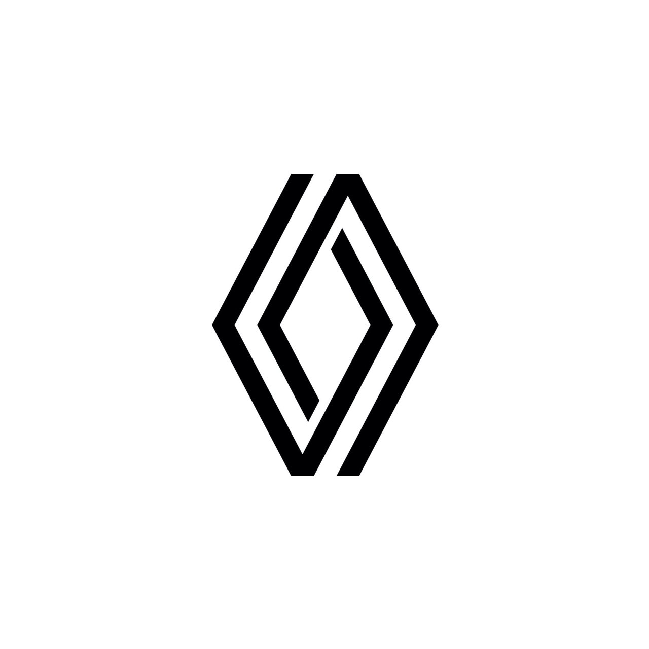
Now… 
… and previously
“The diamond is one of the most recognized shapes in the world, and in the world of the automobile,” Renault design director Gilles Vidal is quoted. “It is a simple geometric shape, with a strong, powerful identity. The challenge was to renew this shape by giving it meaning, along with new, contemporary values to project the brand into the future.
“It is a balance between recognition of the brand’s heritage and entering a new era, symbol of the future,” he continued. “The restyled diamond perfectly embodies the ‘New Wave’ era that Renault has entered.”
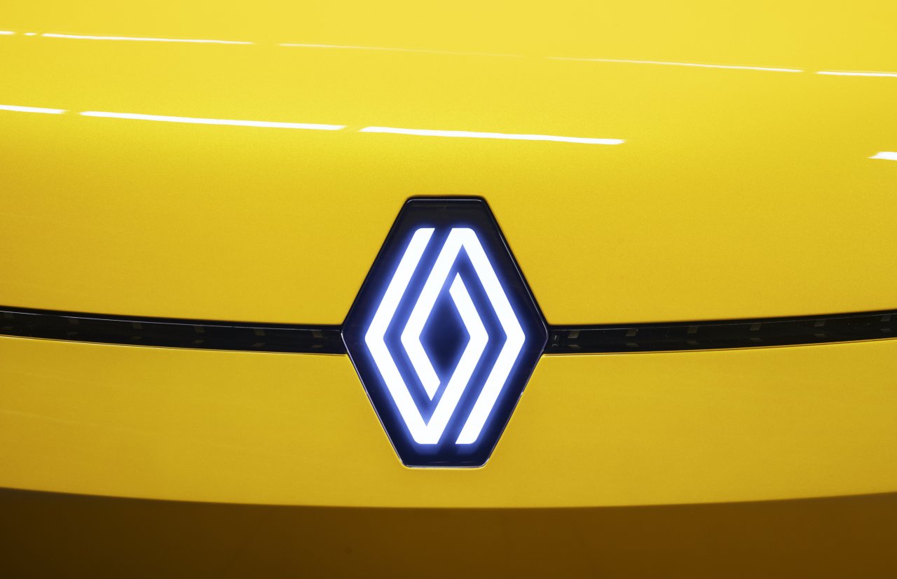
The new logo debuts on the Renault 5 Prototype, a concept car.